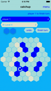
 My latest game release, Catchup came out for iOS last Thursday, and I thought I’d write a bit about my experience developing it.
Stats
First up, how’s it doing? Well, despite a surprise conversation with Apple the Friday before launch, we didn’t get an app store feature. I could show you the typical “long tail” graph, but if you’ve seen any of them before, you know exactly what it looks like. We started with a day of 88 sales, (this at $2.99), followed it up with 34, 26, and 16 sales yesterday. I’m hoping we have a boost again today because it’s no longer the weekend, but essentially, I do not have high hopes. The game’s designer, Nick Bentley, did a great job writing about the game, and making a lot of noise about it in the weeks/days before launch. I definitely credit his efforts for the downloads we did get.
The app ended up climbing to #51 in the “top paid board games” category of the app store.
Reactions / Responses
I think partly because only folks who really care about Abstract Strategy games for iOS have even heard about it, Catchup has had a really great response so far. We’ve got about 12 ratings in the app store, and all but 1 are 5-star. Here are some quotes from the handful of reviews:
“Great implementation of an indie boardgame. The controls are very easy and there are many customization options. The AI has a wide range of levels so it is nice to play at low or high levels of skill.”
“This is definitely one of those games you learn something new every time you play. App is well designed for it and runs really smoothly.”
And some more quotes from around the web:
“Wow. This is beautiful! I thought the ai was crap until i found the manual setting for it… I got pommelled at level 20. The whole ap experience is really very impressive. Nicely minimal and functional… The way i like my abstracts.” – Facebook user
“I like the minimal but pleasantly functional interface.” – BGG user
And I saved my favorite public quotes for last, from Touch Arcade forum user Nachtfischer:
“This is simply brilliant. Just as clean and efficient as the implementation of For The Win was, but even better, with asynchronous online play, dynamically adjusting (and very good!) AI and all kinds of stats you could ever want (it even has a stat for “times you checked the stats screen”, I felt a little caught there, haha).
The game itself is a beloved board game. It has incredibly simple rules, but a ton of emergent complexity, which makes it very elegant – easy to learn, hard to master indeed. There’s a lot of depth beneath the surface here.
It might not look like something special, but if you really love games (and not just semi-related crafts such as audiovisual spectacle, storytelling, Skinner Box mechanisms or whatever), depth and challenge, then you should definitely buy this without a doubt.”
…later, he posted:
“After playing some more, it looks like this is probably going to be my favorite app release of the year so far!”
What could I have done better?
These post-mortems typically have a section for “things I could have done better”, right? But as far as I’m concerned I could have done everything better, so consider all the rest of the headings below a minor subset of bullet points in that overwhelmingly long list.
Beta Testing & Bug fixing
When I decided we should definitely do a beta test, I think I had the right idea. This is a multiplayer application, and I wanted to get people using that multiplayer code ASAP, both to find bugs, but also to gauge the user experience and figure out what I could be doing better. I seriously under-estimated the time needed to run a beta test, (both to find people, and get them playing it, as well as respond / record / react to their suggestions). And then I ended up starting it about two weeks later than intended.
Here’s what I did: I put up a quick google form to collect interested people, then sat on that list for about three weeks. (I’d meant to let it accumulate for maybe a week, but I was still fixing stuff!) When I finally picked users, I basically just sent promo codes to all the ones in the US (because I have evidence that the promo codes only work for US app store users), and who also indicated they would give feedback even if they didn’t like the game. Along with the promo codes, I also sent them a link to a form to collect feedback. The responses were okay, but nothing super revelatory. They definitely helped me find bugs, but the bulk of good UX feedback came from a single individual who would probably have tested the app without our running a beta test at all. (More about that below.)
In short, I still feel like it was extremely useful. It was more useful in terms of finding async bugs, but I could probably have played more games with my handful of friends who had it to get that kind of feedback. If I’d had about two or three more weeks, I think it would have been great to have run more organized play sessions with the beta testers, and perhaps that would have led to more valuable feedback.
Never enough time (or, Things I Never Got Around To Doing)
I really wish I’d spent another week or two polishing the app. In particular, there are some async features I really meant to write in the last month or so of development and just never got around to doing. The main one (which is definitely still on my plate) is opening each individual game when the user opens the app from a notification. I might still get to sneak that into the next release, which is primarily a bug fix release meant to fix Game Center invitations, which I broke in the current app store build (while fixing another bug, of course).
I also wish I’d spent more time working with Nick on promoting the game. I basically let him run with it, and didn’t even hold up my end of the deal by writing a blog post every week until release. (Although this was more a promise to myself rather than a promise to him.) I actually brainstormed a HUGE list of posts I could write, and then only ended up writing a single blog post four weeks before launch, and then finally writing a “release notes” post the day of launch.
Metagame Progression
I’m a big fan of games giving you a solid reason to keep playing. Just about the only thing Catchup does in that regard is show you the level of the AI player, and how that increases/decreases after each game you win or lose. There are also a bunch of Game Center Achievements. While I was implementing the achievements, it occurred to me to space them out so you wouldn’t get a bunch of them after winning one game. So a lot of the achievements are actually dependent on reaching a certain level of AI player. It only occurred to me belatedly (maybe a week before launch) that it would have been really cool to point out that achievement progression in some kind of “campaign screen”, or at the very least in popover messaging after you reach a level where that achievement is available. I have really given this almost no thought, but it feels like something that’s lacking to me.
Programmer UI / UX
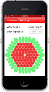 I’ve written a bunch about how long it took me to make Catchup… and talked about some of the reasons, but there is maybe one reason that I don’t think I’ve talked about yet. Mainly, it didn’t even occur to me until today, but essentially, the UI changed quite a bit in various iterations of Catchup. And each one of those iterations took some time. To the right you can see the first (totally playable!) version. Obviously, I knew this was going to change, but if I’d known by how much, and how well the app was going to do on release, I might have been more okay with just releasing that version. (OK, probably not really.)
As someone who presented at GDC this year on UX, you’d think I know a thing or two about it. But the not-so-secret truth is that I really don’t. I can probably fake it better than most, but when someone who really does know a lot about UX gives you honest feedback about it, it just becomes super clear that you don’t know jack. That person for me was Nate Weiner (of Pocket / Read it Later fame). When I got his email, it was one of those moments where you realize you’ve been doing something wrong all along. Fortunately, he was kind enough to preface it by saying that none of them were things he would allow to delay launch. Anyway, here’s a list of UX stuff that I could really have done better. (Over half of these points were made originally by Nate in that aforementioned email.)
- all the popover menus — in particular, I remove the nav bar when I show ’em, and not only does that look weird, but it’s the cause of a number of bugs.
- replacing the “default” Game Center UI — This is another one that, surprise, surprise, would have fixed a number of bugs. In particular, if someone “swipes to delete” a game from the default Game Center UI, your app is not notified, and (AFAIK) there is really no way (no status change even!) to detect that the delete has happened. Plus, it looks like butt. Would have been a lot of work tho.
- Onboarding / tutorial — I sorta knew I was doing this the “easy way”. Even though it’s an interactive tutorial, I basically show all my messages on a popover that doesn’t change contextually. I should have been highlighting all the things the tutorial talks about (and just assumes you will be able to find as soon as you close the popover).
- Game Over Screen — Similar to the tutorial popover, the game over screen could have been made contextually. In particular, it’s been suggested that it should at the very least highlight the group that won the game. (And this should be fairly easy to do, I just wish I’d thought of that before I made the current version of the game over screen!)
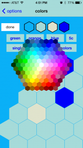
- the Color picker screen — This screen just really blows. I’m happy with how it LOOKS, but it’s not at all obvious how it functions. And there is literally nowhere in the app that explains it. I should probably add a help popover at the very least, but that hasn’t even made the TODO list yet. (OK, now it has.)
- the Game Settings screen — I really tried to make this screen as flexible as possible, but I think there are probably significantly clearer ways to present and allow you to change the AI level. It gets a little better in one of the updates that hasn’t been approved yet, but it’s definitely still a pain point, I think.
- the game screen itself — I would love to still include Game Center icons on this screen. I do also feel like it could better (more clearly) indicate whose turn it is.
When I estimate client work, I always emphasize how much less work there will be for me if the graphic designer has already completed their work by the time I begin. I don’t know why it didn’t occur to me that it would of course take longer for me to do that UX and graphic design myself. Well, if you’d asked, I might have told you it was true, but nobody asked, and I just kept plugging away.
Conclusion
I hope someone finds this useful. Thanks for reading.
EDIT(s): Edited to clarify some points, directly name Nate Weiner, and add references to the “top paid board game” category numbers.



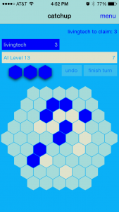
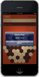 This wasn’t necessarily a bad thing! I’d already decided to go for a flat UI design, (especially because I was drawing nearly all the graphics programmatically!) So the aesthetic of the app didn’t need to change, but in those early days, I hadn’t been using navigation bars. I was using a navigation controller in the project, but pushing and popping the view controllers with custom buttons everywhere (to the right is an early screenshot from that era). This made sense if I wanted a flat design in iOS 6, but iOS 7 was flat by default. During the iOS 7 beta, I spent an hour or two experimenting with the look of the new nav bars, and really liked how the look of the game changed with a consistent iOS 7 style nav bar.
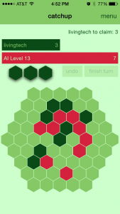
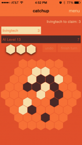
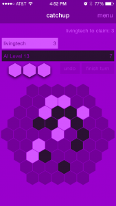 Eventually I decided I’m a big fan of the infinite color schemes, so I definitely wanted to give the user a color picker. That didn’t leave reason to do in-app purchase or unlocking, so that was out. Right now there are three default color schemes, but you can change each of the four colors at any time. I also implemented choosing the scheme from a single color without much trouble (you can see a purple version of that on the right), which allowed me to also throw in a button to change the scheme to match any of the 5C colors. I spent some time trying to figure out if there was a way to get at the color of a user’s phone which would allow me to default to their 5C color, but I couldn’t find a sure-fire way, and I don’t like the single color schemes quite as much anyway, so I dropped that after an hour or so of googling.
 I looked around briefly for another open source project. (Evaluated