Previously on Chesstris…
I have already written a couple of times in the last year about color customization in iOS. My post on how to change the color of a transparent image on iOS is actually one of my most popular posts (based on “organic” traffic coming from google). The other instance was when I posted the slides from my talk about Customizing iOS UI (subtitled “Fonts, Controls & Color”). Neither post stated this explicitly, but basically the main reason any of this was relevant to me was for use in Catchup, a forthcoming game release which will allow you to customize the colors of the entire application. Here are some screenshots from Catchup’s game screen, in the three “default” color schemes:
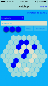
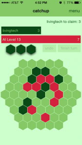
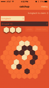
Color changing with [Style sharedInstance]
In the beginning of the project, after implementing a centralized “style” class, (as I sometimes do, usually to facilitate getting a font), I realized that it would be relatively easy to implement color customization throughout the app. That “relatively easy” feature turned into dozens of hours of extra work, and I’m going to go into detail about some of those hours here.
The basic technique was to keep track of four UIColor properties in my style singleton, loading them at application startup, and then making sure that all of my UIViewController subclasses made sure to set all the colors appropriately in viewDidLoad or viewWillAppear:. This necessitated lots of (otherwise often unnecessary) IBOutlets, but that itself was not a lot of extra work. It was definitely more work to just decide which of the four colors in the scheme should be used for each UI element, but I would not consider even that to have been a pain point.
navigation bar hell
So… I was taking my time with Catchup. Early on it was going to be a quick project, but then I decided it was a great game, and this was a showpiece for my board game conversion prowess! I wanted to do it right. That meant it was going to be done when I felt it was done. Long story short, I thought I was maybe half-finished with development when iOS 7 was announced (with its complete graphic design overhaul).
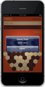 This wasn’t necessarily a bad thing! I’d already decided to go for a flat UI design, (especially because I was drawing nearly all the graphics programmatically!) So the aesthetic of the app didn’t need to change, but in those early days, I hadn’t been using navigation bars. I was using a navigation controller in the project, but pushing and popping the view controllers with custom buttons everywhere (to the right is an early screenshot from that era). This made sense if I wanted a flat design in iOS 6, but iOS 7 was flat by default. During the iOS 7 beta, I spent an hour or two experimenting with the look of the new nav bars, and really liked how the look of the game changed with a consistent iOS 7 style nav bar.
So I bit the bullet and ripped out all my custom buttons and implementing a more traditional navigation bar based navigation. For whatever reason, (somewhere between translucency settings, barTintColor vs tintColor, not to mention Extended Edges) it ended up taking a long time to master the nuances of the new iOS 7 navigation bars. It was a lot of work just figuring out the best way to arrange my storyboard elements, but additionally I needed to change all the nav bar colors based on my color scheme! I tried a lot of different techniques before I settled on the ones I think are definitely “working” in the app today. First I tried using the appearance proxy, but that was super problematic and the colors seemed to be cached weirdly. At one point I thought I needed to style the nav bar in every UIViewController subclass, but eventually I figured out that all I needed to do was call this code on app launch (and any time the color scheme changes):
	// tintColor for the whole app (status & nav bar)
	NSArray *ver = [[UIDevice currentDevice].systemVersion componentsSeparatedByString:@"."];
	BOOL isiOS7 = ([[ver objectAtIndex:0] intValue] >= 7);
	if (isiOS7) {
		// tint color affects the navigation bar links
		[[[UIApplication sharedApplication] delegate] window].tintColor = fontColor;
		[[(UINavigationController*)[[[UIApplication sharedApplication] delegate] window].rootViewController navigationBar] setBarTintColor:[Ketchup_StyleHelper color2]];
	}
	else {
		// ios 6
		[[(UINavigationController*)[[[UIApplication sharedApplication] delegate] window].rootViewController navigationBar] setTintColor:[Ketchup_StyleHelper color2]];
		[[UIApplication sharedApplication] setStatusBarStyle:UIStatusBarStyleDefault animated:YES];
		[[(UINavigationController*)[[[UIApplication sharedApplication] delegate] window].rootViewController navigationBar] setTitleTextAttributes:@{UITextAttributeTextColor: [UIColor whiteColor]}];
	}
}
As you can see, a lot of this was to keep my backward compatibility with iOS 6, but unfortunately that meant one really big compromise — there would be no flat nav bar aesthetic in iOS 6. I’ve made my peace with that. The app looks pretty horrible in iOS 6, but it’s totally functional, and… oh well.
One additional thing I spent time on was changing the status bar text to white or black, depending on the darkness of the tint color. This only applies to iOS 7, and looks like this:
		// dark or light determines styles for status bar and nav bar
		UIColor *colorThatMatters = self.neutral;
		CGFloat hue = 0.0f, saturation = 0.0f, brightness = 0.0f, alpha = 0.0f;
		BOOL success = [colorThatMatters getHue:&hue saturation:&saturation brightness:&brightness alpha:&alpha];
		if (success) {
			if (brightness < 0.7) {
				[[UIApplication sharedApplication] setStatusBarStyle:UIStatusBarStyleLightContent animated:YES];
				[[(UINavigationController*)[[[UIApplication sharedApplication] delegate] window].rootViewController navigationBar] setTitleTextAttributes:@{UITextAttributeTextColor: [UIColor whiteColor]}];
			}
			else {
				[[UIApplication sharedApplication] setStatusBarStyle:UIStatusBarStyleDefault animated:YES];
				[[(UINavigationController*)[[[UIApplication sharedApplication] delegate] window].rootViewController navigationBar] setTitleTextAttributes:@{UITextAttributeTextColor: [UIColor blackColor]}];
			}
		}
Watching the status bar when you manually change that color from dark to light is actually pretty cool, so time well spent, IMO.
Actually Changing Colors – compromises, or lack thereof
Once I decided color schemes were in, there were a number of additional questions. Would I implement a “fixed” (hard coded, but changeable later, of course) set of color schemes and allow the user to select from those? Or would I give the user rope to hang themselves and allow them to change each individual color willy-nilly? (If the former, I needed to pick some good ones, but it would also give me the option of in-app purchase for additional ones, or “unlocking” them via achievements or something.) And finally, could I allow them to choose a single color, and make a scheme programmatically from that color?
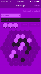 Eventually I decided I’m a big fan of the infinite color schemes, so I definitely wanted to give the user a color picker. That didn’t leave reason to do in-app purchase or unlocking, so that was out. Right now there are three default color schemes, but you can change each of the four colors at any time. I also implemented choosing the scheme from a single color without much trouble (you can see a purple version of that on the right), which allowed me to also throw in a button to change the scheme to match any of the 5C colors. I spent some time trying to figure out if there was a way to get at the color of a user’s phone which would allow me to default to their 5C color, but I couldn’t find a sure-fire way, and I don’t like the single color schemes quite as much anyway, so I dropped that after an hour or so of googling.
For the really curious, here’s the code I’m using to generate my four-color schemes from a single color:
	CGFloat lightBrightness = 1.0f;
	CGFloat darkBrightness = 0.2;
	CGFloat neutralBrightness = 0.6;
	CGFloat baseBrightness = 0.8;
	CGFloat hue = 0.0f, saturation = 0.0f, brightness = 0.0f, alpha = 0.0f;
	BOOL success = [newBase getHue:&hue saturation:&saturation brightness:&brightness alpha:&alpha];
	if (success) {
		self.color1 = [UIColor colorWithHue:hue saturation:(saturation/1.5f) brightness:darkBrightness alpha:alpha];
		self.color2 = [UIColor colorWithHue:hue saturation:(saturation/1.5f) brightness:lightBrightness alpha:alpha];
		self.color3 = [UIColor colorWithHue:hue saturation:saturation brightness:neutralBrightness alpha:alpha];
		self.color4 = [UIColor colorWithHue:hue saturation:saturation brightness:baseBrightness alpha:alpha];
	}
RSColorPicker vs NOT RSColorPicker
There are a few open source color pickers out there for iOS. After I found one I liked pretty well, I didn’t spend much time looking around. (I found out later I actually know someone who maintains one, and felt slightly guilty for not using it.) Unfortunately, the one I picked, RSColorPicker, while it had a decent interface and an API that I liked, really ended up being a pain in the ass to use. I updated the code to work with a new version of it at least twice, and both times spent at least a day wrestling with it. Oddly, my initial integration probably only took a day, so my initial impression was that it was great. I think the first time was when I decided Catchup should be universal. Turns out the color picker didn’t handle @2x very well, so it was slow on iPad. Supposedly this had been fixed… but it wasn’t as easy as just updating to the latest, there were some hacks that had to be applied. I lost at least a day.
Then another time when I switched to using Cocoapods for the project, I figured this was perfect, RSColorPicker was a cocoapod! Only, no it wasn’t. They had a podfile in there, but the project didn’t use tags, and as far as I could tell it had never been added properly to the pods repository. I’d probably totally forgotten what a pain it was to update the previous time, so after a day or so, I threw up my hands in frustration and ripped the whole project out. (I had been running into compiler issues trying to just use the latest version, and it was starting to feel like amateur-hour to me.)
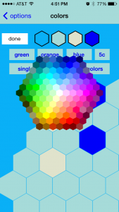 I looked around briefly for another open source project. (Evaluated my friend’s picker, but the UI wasn’t as customizable as I wanted.) Eventually I just thought to myself, “Can’t I use an image and just pick whatever color the user’s finger lands on?” That’s the solution I went with, more or less implementing the
 colorAtPosition: method outlined in this stack overflow answer. After all that RSColorPicker hassle, my new solution took only a few hours to implement. (You can see the picker open to the right.)
coming to color conclusions
It remains to be seen whether any of this work was “worth it”, but I definitely enjoy showing off the color changing feature because it demos well. I guess that’s basically what I’m doing in this post. Thanks for reading!

Pingback: Chesstris » Blog Archive » Color changing in Catchup | Flat Design News