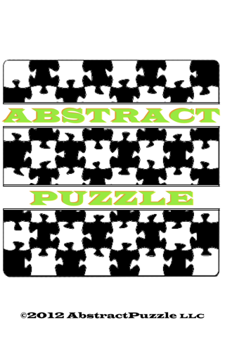
Today I uploaded a new version of the abstract puzzle logo to abstractpuzzle.com.
Here’s a compare and contrast:
![]()
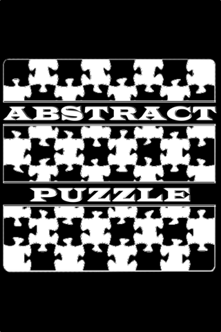
I actually added the white cut-out lines around the text a few iterations back, but just hadn’t updated the website with that new look. But what’s gotten me really excited is the clarity and smoothness of the background puzzle/chessboard. In case it’s not abundantly clear, here’s a corner, zoomed in:
![]()
This is all thanks to my brother John. He came over a few nights ago, and we got to talking about my logo, and he’d actually done a new version of it for me! I’ve talked a bit before about the logo (and name) on this blog, and said then that I wasn’t happy with the quality. I think I must have mentioned that to John at some point also. Anyway, he sent me this new cleaned up version, and for that I’m extremely grateful. Thanks John!
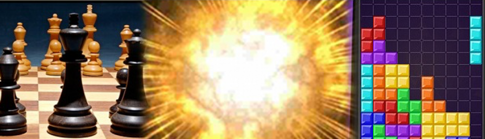
For posterity, and because I think it’s fun, here are two the other versions of the logo that I did, the splash screen for Oppo-Citrus, and ActionChess 1.5.